PROJECT
Create new graphics for job postings across social media platforms and email.
BACKGROUND
The City of St. Louis Park had been using the same stock image for job postings for years and it was time for a change. The image was too informal and really didn’t connect with either the city’s branding or any of the jobs they posted.
The director of communications, Jacque, asked me to come up with new graphics. She wanted graphics for each of the city’s different functional areas. And she gave me the option of using existing photos from the city’s archive, taking new photos, or licensing stock photos when necessary. And she wanted this done as soon as possible as new job openings may come up at any time.
TOOLS
Adobe InDesign (graphics)
Adobe Photoshop (photos)
Digital photography
Getty Images
PROCESS
I suggested that we use photos of the actual work whenever possible while avoiding any personally identifiable photos. Besides wanting to avoid any complications with Tennessen Warnings it also avoids situations where people change jobs and it no longer makes sense to feature them.
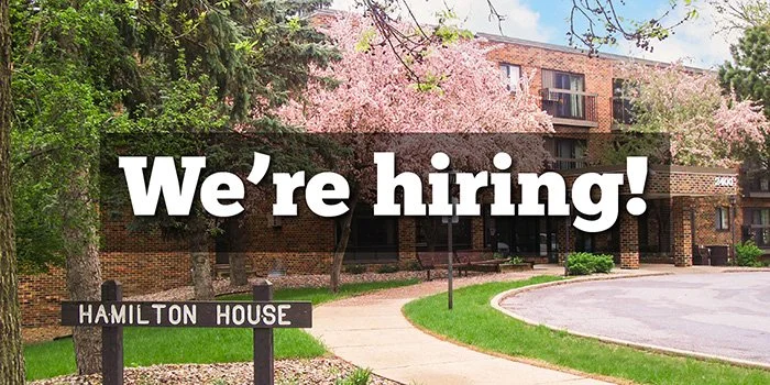
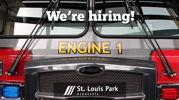
I proposed a concept of a simple template with a “We’re hiring!” label across the upper part of the graphic and the city logo on the bottom, with the background photo matched to the job area. The template approach assures consistent placement and appearance of the text and logo making it easy to recognize as a city job posting even though the background changes. And if you’re irked the “h” in “hiring” is lowercase, that’s how the city’s style guide specified and what the client wanted.
I combed through the city’s existing photos, reviewing potential photos with city staff, and also taking new photos when suitable ones weren’t available. In a few cases I also proposed stock photos licensed from Getty Images. Regardless of the source, I used Photoshop to ensure the photos had consistent visual quality. And in a few cases I used Photoshop to fix issues like anonymizing the officer’s badge number.
RESULTS
We had initially identified 16 functional areas to create graphics for and I delivered 4 files for each one:
Tall for FB and Instagram feeds (no longer square in 2023)
Wide for Twitter and LinkedIn (same aspect ratio in two sizes)
Wide for GovDelivery with modified layout
The chief’s favorite photo
The GovDelivery format was requested late in the process, essentially after the other graphics were approved. This was tricky as the GovDelivery graphics needs a slightly different aspect ratio and a different layout: no city logo since it’s already elsewhere in the email and the “We’re Hiring!” needs to be vertically centered. With some careful editing and repositioning of photos, I was able to make them work.
As a quality check, I showed the graphics to a variety of people and asked them to guess the associated job, and people were consistently able to guess correctly. The city immediately started using the graphics, and I also provided them with an InDesign template so they could create more as needed. Several city staff including the fire chief also complimented the new photos I took for the Fire Department.
And here’s a scaled sample of all the initial designs in the layouts needed for the different platforms.


