PROJECT
Create a flyer and social media graphics for a new all-terrain wheelchair available for use.
BACKGROUND
Westwood Hills Nature Center (WHNC) acquired a Grit All-Terrain Wheelchair, a really cool resource that lets people in wheelchairs navigate the outdoors with much greater freedom in all seasons. They’re relatively expensive though so WHNC was excited to let the public know its available and free to use. The availability would be announced via social media, an event at St. Louis Park City Hall, and with flyers at the WHNC visitors center.
Westwood Hills Nature Center
My client point of contact was a naturlist, Jamie, with great knowledge of the nature center. She was completely open to my ideas on how to design the deliverables. The only hard requirements were to include the logos of the three entities involved in the program.
TOOLS
Adobe Illustrator (illustration)
Adobe InDesign (flyer)
Digital photography
Adobe Photoshop (photos)
PROCESS
I quickly discovered that Jamie and the director of WHNC both assumed I would simply take pictures of the wheelchair. However, thinking of the APA’s guidance to “put people first”, I discussed how that would be focusing on the wheelchair instead of the people we want to use it. And that my first thought would be to take some dynamic photos of real people in the community using the wheelchair - that would be the most engaging content. One problem though, we had to get this done before it was available for use. And I did not want to stage any photos with a person who doesn’t actually use a wheelchair. I also contacted the company, Grit, to see if they had a press kit or something similar with assets we could use. In short, they did not. So I suggested we try an illustration instead.
Whiteboard concept sketch
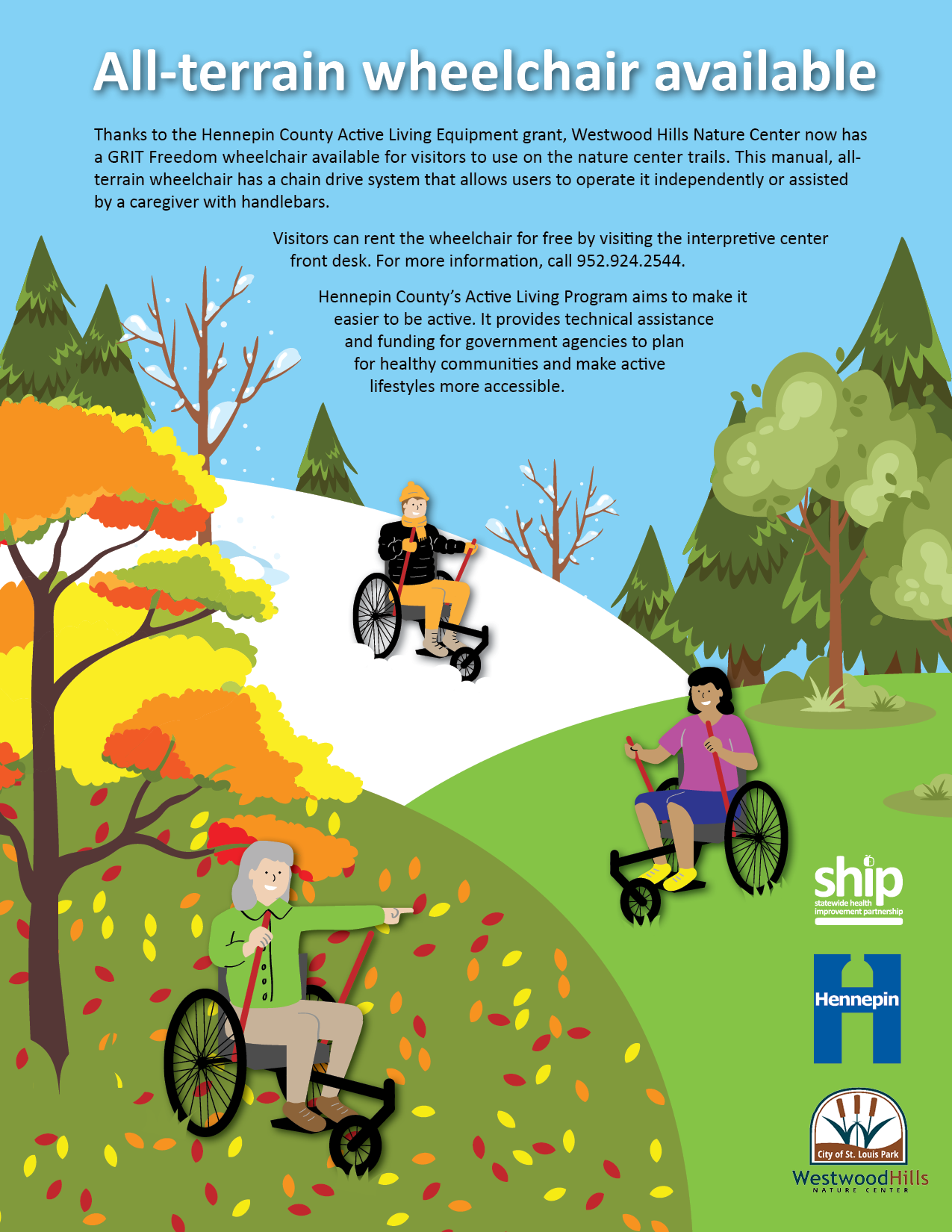
Illustration allows us to show a diverse set of people enjoying the nature center in a range of seasons and conditions. After sketching concepts on a whiteboard I discussed them with Jamie and received positive feedback to keep going in that direction. The visual style of WHNC publications reminds of Real Simple magazine - flat illustrations, natural colors, cartoon figures with features more realistic than abstract.
The content shows people with different skin tones, different ages, and different genders using the Grit wheelchair to explore snow, forest trails, and enjoy the fall leaves. The people and wheelchairs have proportions consistent with their real-world counterparts.
I also took photos of the Grit wheelchair in a variety of locations around the nature center. While the illustration would be the featured graphic, it would still be helpful to have photos of the wheelchair in the actual locations as supporting content. The WHNC director took me to multiple scenic areas to capture the variety available to visitors.
RESULTS
I created a 8.5x11 flyer featuring an illustration and providing information about how people can use the Grit wheelchair at WHNC. I also created social media graphics with similar content and photos that also allowed us to post about it multiple times without simply repeating the same content.
The program was announced via social media (FB, Instagram, Twitter, Nextdoor) and the flyers were made available at the visitors center. I received a wonderful update:
“A 96-year-old man and his son visited the nature center yesterday, specifically because they had seen the marketing about the all-terrain wheelchair. The father was the first nature center customer to use the wheelchair and spent a couple hours with his son traversing all the trails in the nature center. He told [the director] what a fantastic asset the wheelchair was, because it had allowed him to get out in nature and forget about everyday troubles.”
Now if WHNC staff can gently ask to take some photos or suggest people tag them on social media…


