PROJECT
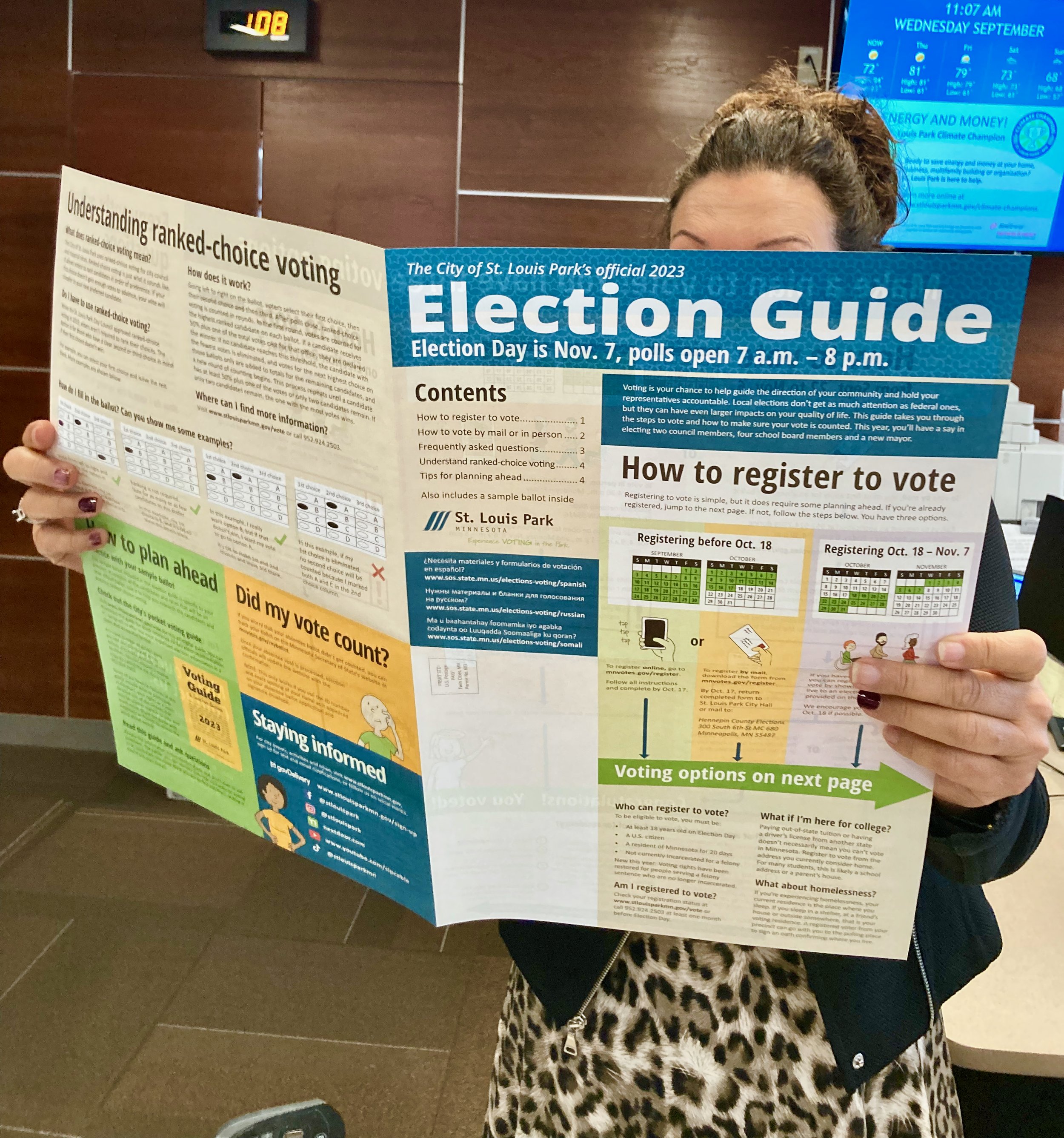
Redesign the annual “election edition” of the Park Perspective newsletter to improve its effectiveness at helping residents successfully vote. I did this as an employee of the City of St. Louis Park.
BACKGROUND
The City of St. Louis Park puts out a special edition of its Park Perspective newsletter each year to provide information about upcoming elections. Other than relevant content changes for local versus national election years, only relatively minor changes have been made in recent times. Unfortunately, people found the content to be piecemeal and confusing and lacking a cohesive visual style.
The new communications manager, Ben, wanted to take a fresh look at it and gave me the freedom to propose changing as little or as much as I deemed necessary. The only constraints were to keep it to the same size (4 tabloid size pages) and, at minimum, to cover a set of required topics from the city’s elections staff.
TOOLS
Adobe Illustrator (characters and ballot examples)
Adobe InDesign (everything else)
PROCESS
Ben and I agreed to a general workflow:
Meet with elections staff for initial input and direction
Simultaneously, I would do a first draft of the overall layout while Ben did a first draft on the body copy for each topic. I would merge the draft copy into the draft layout and all subsequent reviews would be made on the latest integrated document.
Review and revise with Ben.
Review and revise with senior designer.
Review and revise with senior copy writer.
Review and revise with department director.
Review and revise with elections staff.
Final review before sending to print vendor.
The initial meeting with elections staff was key, as our primary contact, Michael, told me to check out the Center for Civic Design (CCD), look at their research, and try to implement as many of their recommendations as appropriate and possible. I hadn’t heard of them, and when I looked at their website, I was like a kid in a candy store! They had so much great research, including voter ethnography, and several recommendations were echoed in their findings as well as in the findings of other organizations they referenced.
My whiteboard of initial design goals and rough layout
After the whiteboard, I created a 1:1 paper mockup of the content sections so I could show Ben how it would look as you hold it, unfold it, and open it like a resident would. Then I recreated the layout digitally in InDesign and incorporated Ben’s copy. And then we were off to the races going through numerous review stages. If that seems like a lot of review stages, it was. Still, the document didn’t go through any major design changes after the initial layout - it was mainly copy editing and incremental tweaks.
Ideally, I would like to have conducted my own ethnographic voter research with the local residents. And I would have done A/B testing on various design decisions to get a more concrete idea of how impactful certain design choices would be. However, given our time constraints, I was extremely happy to have great secondary research sources available.
Here are some of the specific design changes I made in addition to the CCD’s recommendations:
Rename to “Election Guide” as people generally find “Park Perspective Special Edition” vague and confusing
Increase body copy to 12pt size to enhance legibility
Consistent application of background colors: blue for city messages, light green/ light orange/ light purple for specific scenario instructions, tan for detailed information, green for major actions
Consistent use of flat graphic style and avoiding textures and gradients
Original comic-style character illustrations showing diversity in gender, skin tone, age, and physical ability
Versions as it evolved through the review stages starting with the hand-made paper mockup on the far-left
RESULTS
“Wow! This. Is. Amazing.”
Those were the first words spoken by elections staff when I handed them a printed copy of the near-final version. I especially loved hearing an audible gasp followed by “people always ask if their vote counted” when they turned to the last page. After all this, you may also be wondering what the CCD’s specific design recommendations were. I rehearsed some talking points for my meeting with the elections staff:
My cheat-sheet of talking-points
And most important, the guide helped more residents participate in the election.
“You can easily claim that that guide was pivotal to our record turnout. We saw several people bring it in, point to it, and use it as a resource. You can quote me on that.” - Michael Sund, Elections Staff
Some statistics:
The city saw a historic turnout for a municipal election, up from the most recent high from 2019 of 20%.
Election administrators look at the number of spoiled ballots to estimate times when a voter may have made an error and went back to get a new ballot. Only 1.2% of voters needed to correct a ballot, which is lower than the 2% average for St. Louis Park, and much lower than averages in other communities that use ranked choice (typically 3-4%).
St. Louis Park continued to have a high rate of registration with only 4% of voters registering at the polls, meaning 96% of voters were registered in advance of election day.
Voters rated the service they received the highest of any election since the start of the annual voter survey in 2021.
This has easily been the most interesting and rewarding design project I’ve worked on to date. I love that I got a deeper understanding of elections and voter behavior. I love that my work resonated so well with elections staff that their delight was obvious and immediate. And I love that this will help empower more people in the community to make their voices heard.
